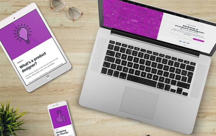
We all know the importance of having a mobile friendly site, but what about mobile friendly emails?
Many brands have cottoned on to the fact that mobile is definitely the way of the future, but less than 56 percent of brands appear to offer mobile friendly emails.
According to data recorded by Litmus, nearly 50 percent of all marketing emails are read on mobile devices and this number is only expected to grow in the coming years.
Email marketing still remains to be one of the most effective ways to reach your audience directly and if you are not catering to your mobile readers then chances are you are really missing out on many promotional opportunities.
If your brand has not yet joined the mobile email-marketing revolution, there is still time. Here is all you need to know:
The Statistics
Curious how your company compares to others?
A recent survey conducted by Litmus found that in June 2015, only 48 percent of businesses had both a mobile friendly webpage and mobile friendly email marketing system. Another 37 percent had a mobile friendly webpage but no mobile friendly emails. 7 percent had neither.
Research also found that from 2014 to 2015, mobile responsive emails grew by a massive 74 percent, proving that the trend is really here to stay.
This massive pattern of growth may have also has also been triggered by the fact that consumers have been deleting or unsubscribing from email lists if they do not function properly on mobile devices or tablets.
Studies have also found that mobile readers are far more engaged than their desktop counterparts and are more likely to convert into paying customers.
While these types of statistics may vary for your brand and target audience, offering mobile-friendly emails can definitely help move you into a stronger position.
Creating Mobile Friendly Emails
There are four main mobile-friendly email design formats that you can use to help make your email marketing strategy more effective. These include:
1. The Responsive Design
The most popular of all the designs, responsive emails are the easiest to work with as they automatically change the layout and size depending on the device.
These changes are often done automatically by an email marketing provider such as Aweber or MailChimp, taking out the need to do any additional coding or optimising.
Most email marketing software systems are also able to provide data on how many subscribers are using their mobile or desktop device to view your emails.
2. The Responsive- Aware Design
This format uses a responsive design for the headers and footers and then has a mobile- aware design for the primary content block.
This design allows users to easily navigate through the header and footer section of the email in order to click through to something else. This strategy works best to if you want readers to click through to another landing page, app or sales page.
3. The Mobile-Aware or Mobile- First Design
This design format has a single column layout, large text, smaller images and well spaced buttons and links. Around 15 percent of brands tend to use this type of design.
The positives about this layout is that it is very simple and easy to design and allows marketers to convey their main message in a concise way. The only downside to using this design is that you would have to create a separate desktop version.
4. Quasi-Mobile-Aware
This design caters mainly to desktop users but also tailors an experience for mobile users by making the primary content block mobile-aware.
This means that the main content appears to be mobile friendly however, the headers and footers may not load as efficiently.
This used to be one of the most popular mobile-email platforms but now most companies are ditching this format for responsive designs.
Choosing the Right Design for your Brand
The best design for your brand really comes down to your what your audience truly wants.
For example, if you have fewer than 10 percent of your emails read on mobile devices, a quasi-mobile design may be fine. However, if you have more than 20 percent of your readers viewing your emails on mobile devices you may want to consider a Responsive or Mobile-Aware design.
Keep in mind as well that mobile use is definitely on the increase, so you may also want to tailor your email marketing strategy for projected outcomes as well.
Another important factor to consider when it comes to choosing a design is what type if experience you are trying to create for your audience.
Tracking Your Analytics
Once you have put your mobile-friendly email design into action it is important to track your analytics to see how your mobile audience is responding to your design.
Over time you may start to notice different trends between your desktop and mobile users and from there you can start learning about your audience and ways to optimise the experience for both users.
Are mobile-friendly emails part of your marketing strategy?

Hey!
It looks like you're browsing in . Would you like to switch over to the website?