Choosing colours for your website is so much more than just aesthetics. Colours carry rich psychological triggers that can actually influence your customers purchasing decisions.
In fact, colours are so crucial when it comes to the buying decisions of your customers. One study even found that 85 percent of shoppers place colour as the primary reason for why they buy a particular product.
At first glance this statistic may seem unbelievable, but then when you look a little deeper it does make sense.
Colours are able to trigger certain responses in humans including emotions, thoughts and feelings. Humans are also extremely visual creatures, so it makes sense that colours would have an impact on us. Even if it is only on a subconscious level.
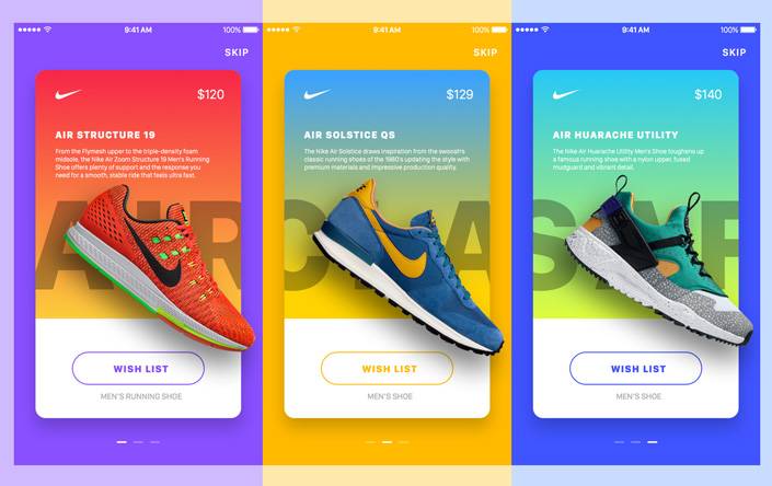
A classic example of this can be seen in pretty much every fast food chain in the world. All of their branding colours include red, as this colour stands out and makes people step up and take notice.
When you are cruising down the highway looking for a bite to eat, the red sign of McDonalds, KFC and even Red Rooster can often be spotted from quite a distance away.
Even as you stroll down the snack isle at your local Woolies, you will see that many brands favour bold and bright colours including red, yellows and blue.
These colour choices are not random, instead they are based on years and years of research.
Red has been shown to not only grab your attention but has also been shown to stimulate your appetite and make you take action. If you are tempted to purchase a greasy snack item, seeing red may just make you say yes.
Don’t let something small like choosing the colour of your website fool you. It is extremely important when it comes to designing your website and creating the logo for your brand.
In many ways, the colours you choose, or don’t choose, can have a huge impact on the success of your company and if people are going to step up and take notice, or simply keep walking.
In this article, we are going to take you through 8 important tips to consider when it comes to choosing the colour scheme of your website.
We are also going to share with you ways to use colours to boost conversion rates and increase sales.
Before we can begin with any of that however, we need to take a look at branding and the importance of colour.
Choosing Colours for Your Brand
Establishing a solid identity is super important for any brand. When it comes to creating your brand, the top things you want to consider include-
- Creating a sense of trust
- Establishing professionalism
- Establishing the overall vibe/tone
- Working out what you stand for as a brand
- Making consumers feel comfortable
- Making consumers feel confident in what you are offering
- Creating life long brand advocates
Of course, there are many other factors to consider, but one of the most overlooked factor is, you guessed it- colour.
Research has discovered that colour can increase brand recognition by upwards of 80 percent. That is huge and well worthwhile considering.
Research has also shown that colour has a correlation with the perceived value of your brand as well.
From a psychological point of view, brands are considered the most valuable when their logo is blue, and least valuable when their logo is purple.
Here are the top colours in order of value from highest to lowest-
- Blue
- Black
- Red
- Yellow
- Orange
- Green
- Purple
Does this colour-value scale resonate with the brands you have observed?
Along with colours being ranked in terms of brand value, it has also been found that colour tones can have an affect as well.
Monochrome brand logos were considered to be valuable 50 percent of consumers, two colour logos were considered to be valuable by 30 percent of consumers and one colour logos were determined to be valuable by 19 percent of consumers.
This doesn’t necessarily mean that you have to go out there and drastically change your logo, but it could be worth considering how your consumers rate and value your logo.
If you are still in the early stages of creating your business or looking to rebrand, considering the colours that you choose can go a long way to helping your business stand out from the crowd.
At the end of the day however, the most important thing is to ensure that your logo is a true reflection of what your brand stands for and what feeling your brand wants to emulate.
The Colour Scheme of Your Website
Choosing the right colour for your brand is important, but choosing the right colour for your website is just as important.
While you want the colours on your website to be aligned with your brand, it is also worthwhile experimenting with a few additional colours as well.
When it comes to choosing the colours for your website, you definitely don’t want to leave it up to chance and you definitely don’t want to simply pick colours because they look good to you.
Of course, you do want to consider aesthetics, but it is more important to consider your audience and what colours may have an impact on them psychologically.
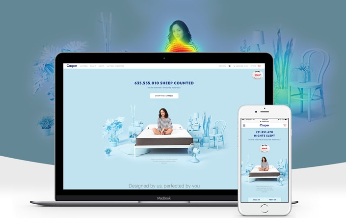
Choosing the perfect colour is also important, as research shows us that people judge a product or service in just 90 seconds.
In that small time frame between 62 and 90 percent of that assessment is based on colour alone.
If you choose the right colour scheme that fits your brand and your audience, it can drastically help to increase sales and conversion rates.
It can also help to ensure that your audience are drawn to your products and not turned away from them.
When it comes to choosing the perfect colours for your website, here are 10 factors to keep in mind-
1.) Discover How Colour Influences Emotional Responses
Different colours have different psychological influences. According to the latest research, here is how some of the most popular colours affect humans on an emotional level and how they feel in response to the colour-
- Yellow: optimistic, youthful, can grab attention but does not evoke action (perfect for window shopping or “coming soon” call to actions)
- Red: energy, increased heart rate, creates urgency, inspires action, can also be seen as aggressive
- Blue: trust, security, calmness, dependability
- Green: wealth, relaxing, soothing, inspires feelings of nature, healthy
- Orange: inspires action, energetic, can be aggressive
- Pink: romantic, feminine, youthful, sweet
- Black: powerful, luxurious, sleek, high-end, exclusive
- Purple: soothing, calming, beautiful (often used on beauty products)
- Grey: neutral, calm, balancing, professional
When choosing the colours for your website, consider these stats and see if it helps to earn your brand more conversions and sales.
2.) Consider your Demographic Overall
Once you have understood the psychological influence of each colour, you need to turn your attention to your audience.
What types of emotions are you trying to arouse in your most desired customers?
By understanding what motivates and inspires your customers, it can help you to choose the appropriate colours for your website and for your call to actions.
Here are a list of emotions that you may be trying to evoke in your customers and the colours you should consider using-
- Excitement: red
- Stimulation of appetite: red
- Impulse purchases: red
- Grab attention: yellow
- Trust and security: blue
- Subscribe: orange
- Confidence: orange
- Health: green
- Relaxation: green
- Imagination: purple
- Creative: purple
This list may help you to understand what colours you should use and where you should place them around your site.
For example, if you are a food delivery company and want to evoke feelings of hunger and action, choosing red would work best.
Just the same, if you were a health company offering healing services or herbal medicines, you may want to choose green.
For best effects, consider using one main colour for your website and then one or two other colours that compliment it for other things around your website like call to action buttons and so on.
3.) Take into Consideration the Gender of your Audience
This may not apply to your business, but certain companies may benefit from targeting their colours to a specific gender.
Studies have shown that both men and women have colour preferences that can drastically effect their moods and influence their purchasing decisions.
While it may not be possible to avoid using these colours all the time, it does help to know which colours your audience may not find as satisfying.
Here is a breakdown of favourite and least favourite colours by gender-
Men’s Favourite Colours (in order from most favourite to least)
- Blue
- Green
- Black
- Red
- Orange
- Gret
- White
- Brown
- Yellow
Women’s Favourite Colours (from most to least)
- Blue
- Purple
- Green
- Red
- Black
- Orange
- Yellow
- Brown
- White
- Grey
Keep these factors in mind when deciding on your colour scheme, it may just help to give your website the boost you have been looking for.
4.) Take into Consideration the Age of your Audience
Did you know that certain colour preferences can also be linked with age?
Age can play a role in the type of colours a person is attracted to and can change the psychological trigger.
Here are a list of favourable colours to use dependent on different age brackets (colours are listed in order from most favourable to least):
- 1-18: blue, green, red, orange, grey
- 19-24: blue, green, purple, red, orange, yellow, brown, white, black
- 25-35: blue, green, purple, orange, red, brown, black, white, yellow
- 50-69: blue, purple, red, orange, yellow, grey, black
- 70+: blue, white
It is interesting to note, that as people get older they generally only prefer colours like blue and white. It is also interesting to note that blue seems to be a likeable colour across all the age ranges.
Again, this is all helpful information to keep in mind when it comes to choosing the perfect colour scheme for your website.
5.) Decide on the Colour Palette of your Website
At this point you may have a primary colour in mind, but it is recommended to also have two other colours as well.
Of course, this is not going to work for every brand, but here is what is suggested-
- 60 percent of your website should be your dominant colour
- 30 percent of your website should be a secondary colour
- 10 percent of your website should be an accent colour
This is a great guide to follow and will help you to bring together a beautiful website that looks complete and professional.
When it comes to choosing the three colours you are going to use, consider opting for complimentary colours, or even the same colour in different shades.
Let’s take a look at some examples from popular online websites-
- King Kong: black, green, grey
- Huffington Post: teal, red, black
- Elite Daily: black, blue, green
- Mashable: blue, white, black
While you can definitely use less than three colours, having any more than this could lead to confusion and make your website tricky or overwhelming to understand and navigate through.
6.) Avoid Personal Biases
When it comes to choosing the perfect colour scheme for your website, it is important to leave your personal biases and stereotypes out of the picture.
Just because you are launching a product for women, doesn’t mean that pink is necessarily the best choice. Just the same, launching a product for men doesn’t mean that your website has to be adorned in blue.
Biases can also show up when you have a personal preference towards a certain colour. Choosing green or yellow for your website because it’s your favourite colour may not be a good strategy when it comes to growing your business and making sales.
To choose the perfect colours, you need to consider your audience and pick colours based on what is going to be most meaningful to them.
7.) Consider the Competition
When it comes to choosing the perfect colours, taking a look at your competition and what they have done can help.
It is also likely that your more established competitors have put a lot of time and research into choosing the right colours, so you can piggyback off this and hack your way to the top without having to do all the research.
There is no mistake that pretty much all fast food chains use red on their website and in their branding efforts. This is because red is a colour that works to drive sales and bring customers in.
If you were starting a fast food business, you could use this example to help you choose the perfect colour scheme.
There are two ways that you can really do this- either you could join the trend and copy what your competitors are doing, or you could experiment with doing something completely opposite.
Depending on your intention and your brand mission, it may benefit your business to do something completely different from the norm. This is where having a solid branding idea is going to help you make the best decision.
If your brand is all about doing things differently, it may make sense to experiment with other colours, but if you are looking for the tired and true method, copying your competitors may just be the most solid choice.
8.) Test and Compare
Like anything with marketing, you have to do a certain amount of testing. Once you have chosen your colour scheme track how it is working for a few months.
At the end of your tracking period, consider making small tweaks and changes to your colour scheme to see if you can increase conversions and boost sales.
Track everything again and make necessary changes till you find a colour scheme that fits.
Alternatively, you can also run a split test and see which colour scheme is performing the best. This will help you to save time and will also show you how your audience operates.
To help give you some pointers to start, here are a few colour scheme ideas that you can test on your page-
- Change the colour of your call to action buttons
- Change the the colour of your header text
- Change the hover colour
- Change the menu bar colour
- Change the hyperlink colours
Of course, this is just a rough guide, but hopefully it will point you in the right direction to knowing what to test and what to change.
Conclusion
Don’t underestimate the importance of choosing the right website colours.
Colours are able to trigger us on a psychological level and can influence purchasing decisions and different actions.
When it comes to choosing the perfect colours for your website, be sure to –
- Pay attention to the mission and intention of your overall brand
- Research what your audience is most attracted to- consider their gender, age and what feelings you wish to evoke
- Pay attention to the different colours and their psychological triggers
- Choose a colour palette of three complimenting colours
- Be sure to avoid personal biases and picking colours just because they are your favourite
- Check what your competitors are doing and piggyback off what has worked for them
- Keep testing and assessing the colours you have chosen, consider running split tests


Hey!
It looks like you're browsing in . Would you like to switch over to the website?