Did you know that 85 percent of all impulse buys are based on colour?
It seems high, but colours run deep in our psychology and are key factors in the clothes we wear, the car we drive and how we decorate our surroundings.
Whether we realize it or not, colours play an important role in both the conscious and subconscious decision to purchase a product. This is because colours have the ability to make us feel a certain way and in turn, can trigger us to make a purchase or abandon our shopping cart altogether.
One study even found that up to 90% of all judgements made about a product were based on the colour of it.
Colour is a powerful influencer and understanding how colour can effect your sales can help you tap into a whole new way to boost your conversions.
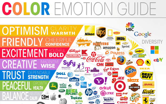
The Colours Around Us
The human eye can process around 10 million different colours and each of these colours also create an emotional reaction. While some emotional reactions will depend on the person, psychology has also narrowed down generalised expressions of colours.
It all starts with gender. Women typically prefer softer more muted colours whereas men prefer brighter colours. Colour preferences can also be influenced by age.
For example, small children are really drawn to bright colours and the colour black, whereas older adults are drawn to softer and less harsh colour schemes.
Have you ever not purchased a product because it didn’t come in your favourite colour? Chances are you do it more than you realise.
In fact, 66 percent of individuals won’t buy a product if it doesn’t come in their favourite colour or it doesn’t match their house decor, clothes or other factors.
Colours and Conversions
Colours have an important influence when it comes to sales not only on product labelling and packaging, but also the colours around it. This includes the colours that you choose to paint the walls in your store and the colours that you choose to make your sales page with. Brick or mortar or online, when it comes to colours, the results are usually consistent for both.
When it comes to the promotion of your brand, colours have also been shown to boost brand recognition by up to 80 percent and full colour page ads also receive 26 percent more recognition than black and white ads.
One study on the psychology behind red and blue conducted by the University of Virginia found that:
– When a consumer was in a high pressure environment or the product was believed to be scarce, they were more likely to buy when shown the colour red rather than blue.
– When a consumer was in a low pressure environment and there were copious amounts of the product, consumers were less likely to buy if the colours were shown in red and more likely to buy if the colours were in blue.
Colour psychology can run deep and be personal to the individual, however here are a few tested ways that colours effect conversions:
Red: associated with stop, danger and boldness. Red is commonly used for branding because it is a memorable colour that often stands out in the crowd. Red is one of those colours that can really go both ways. It can be super effective in getting some customers to purchase but can also be too aggressive for others.
Burgundy: associated with money, refinement and luxury. In studies this rich, reddy brown colour helped to increase overall spending price. Burgundy is slightly different to red in that it is more muted and is commonly associated with royalty. Burgundy may be a good colour to try if red is proving to be too aggressive for your demographic.
Black: associated with sophistication. In studies, black was shown to help increase spending and also helped to increase conversions for high end products. Black is always “in” and is a great colour choice depending on your product and target audience.
Green: associated with being eco-friendly and non-aggressive. In several studies, green was shown to be an effective colour for call-to-action buttons. Green has also been shown to reflect harmony, however should be used with caution when it comes to branding. Because green is a colour commonly reflected in nature, it doesn’t really stand out and may blend in too much with the crowd.
Orange: associated with fairness and affordability. In studies, the colour orange resulted in higher conversion and click through rates. This may be because orange usually indicates urgency. It is not as aggressive as red, but still calls to the customers attention. Orange is also commonly associated with being a “fun” colour and may do well for some products that are trying to tap into this feeling.
Blue: associated with trust and dependability. In studies, blue consistently performed well in conversion testing. Customers also appeared to trust companies that have a lot of blue in their branding or in their sales pages. Blue is a very likeable colour and appeals to a wide variety of demographics.
Pink: associated with vulnerability, romance and femininity. In studies, light pink did not perform well, mainly due to the fact that it is believed to stir up feelings of vulnerability. Dark pink however did perform well for products that were targeted to women.
Grey: associated with loneliness and neutrality. In studies grey also did not perform well in terms of boosting conversions and spending. Grey did do well however when it was paired with a brighter colour like Yellow.
Yellow: associated with happiness, freshness and joy. While yellow is commonly associated with positive emotions, it did not perform well in terms of conversions. This may be because some people associate yellow with feelings of anxiety and a lack of commitment.
Brown: associated with boredom and conformity. In studies, brown did not work well for conversion rates and did not help increase overall spending. Even though this study found brown to be an ineffective colour, it may work well if paired with a complimenting colour or if your brand or business warrants a brown tone.
Testing colours on your webpage will really take some trial and error and will depend on who your target audience is and what type of product you are selling.
Colours also have different meanings in different cultures, so it may be beneficial to explore how other culture’s view colours, especially if your product is being catered to an international audience. For example, in the Western world black is typically worn at funerals whereas in countries like China, white is worn to funerals.
This just goes to show the different connotations that colours have all across the world.
To summarise, when it comes to conversions the colours that consistently performed the best were- red, green, blue and orange.
Colours for the Mindset of Shoppers
Depending on what type of product you are trying to sell, you may want to pay attention to the different types of colours which have been determined as being most effective depending on the mindset of the shopper.
Impulse shoppers:
If you have a product that requires shoppers to really make an impulse purchase choose dark blue, orange or black for your store or webpage.
Budget Shoppers:
If you have a product that you want to appeal to budget conscious shoppers then choose navy blue, green or teal.
Traditional Buyers:
If your products fit into neither of the above categories choose light blue, bright pink or green.
For brick and mortar businesses, warmer colours were shown to attract people into the store, whereas cooler colours encouraged more contemplation and higher sales.
Choosing the Perfect Colours for Your Company
Now that you have an understanding of the basic psychology behind colours, it is time to work out which colours will do best for your company.
Keep in mind that while your customers relationships to colour can be unique, one thing that has constantly stood out in testing is customers expectations.
For example, say you run a law firm, you may want to shy away from using bright hot pink and purple. Instead you may want to stick to black, blue and grey. Even though this may seem boring, studies found that when colours did no match customers expectations they were less likely to trust the company. This means that your colours should be chosen on what is appropriate for your sites content and service.
It may take some some trial and error to work out which colours will do well for your company, but here are some questions to get the ball rolling…
– What colours fit well with the personality and mood of your company? Do you want to appeal to a luxury market or are you for the budget conscious?
– How does your chosen colour scheme fit with your audience expectations? Does it match?
– What colour would most likely appeal to your demographic?
– Do your colours match your site content and theme?
Also think about what colours you want to choose to make your call-to-action buttons stand out and get noticed. For example, e-commerce giant Amazon uses yellow for their “add to cart” button but then also uses grey for their secondary conversion buttons.
When it comes to choosing the perfect colours for your website, e-commerce page or brick and mortar shop, it really comes down to your demographics, your products and the mood and feeling you want to create with your company.
Take the time to also split test different colour themes and be open to the fact that your company’s colour scheme may not follow the trends in research.
Colours play a vital role in marketing psychology, how will you use them to drive your sales?
Hey!
It looks like you're browsing in . Would you like to switch over to the website?